OUR REFINED BRANDING
20 April 2025
Written by Leo Jansen
Take a look at our updated branding and logos for this upcoming STEM Racing Australian National Finals!
These changes, featuring the removal of our blue gradients, refined colours and the championing of our Indigenous Australian symbols, aim to ensure consistency across all our digital and physical assets, and allow us to stand out at the competition!
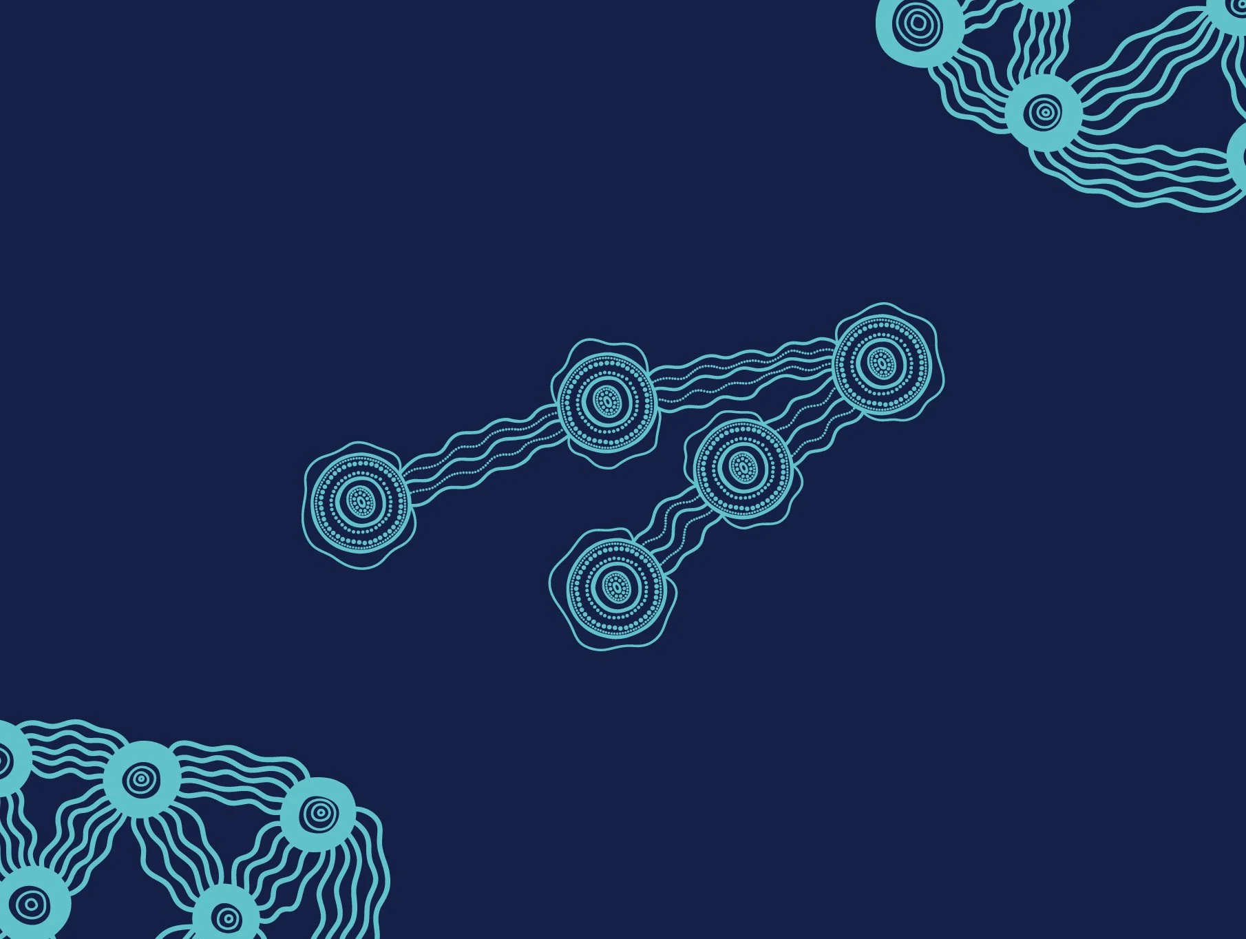
These particular patterns that we have previously showcased at the World Finals in Saudi Arabia were designed by talented indigenous artist, and proud Kamilaroi woman, Katie Bugden.
The indigenous iconography used within these designs are symbolic of our team's journey, and our connection to our space themed brand as we continue to reach for the stars! Each circular meeting place is a symbol of our individual team members, connected by flowing songlines symbolising our connectedness as a team. And the outermost rings on each meeting place is the traditional symbol for The Corona - the outermost atmosphere of the sun, connecting with our space theme.
Visit: www.katiebugdenart.com to learn more about Katie Bugden and her works

Katie Bugden